MIM: Movement is Medicine

YEAR
March 2022
OUR ROLE
UX Research/Design, Prototype, Iteration
RESOURCES
MIM: Movement is Medicine App

MIM (Movement is Medicine) is an iOS app designed for a fictional physical therapy company, Move Right Physical Therapy. The MIM app and a complimentary responsive site were designed for hybrid physical therapy. Hybrid physical therapy combines traditional in-person care with at-home self-guided care.

What to Solve

Project Overview

The Problem

Due to rising out-of-pocket expenses for patients and clients, finances have become a consumer barrier. In addition, insurance reimbursement has been reduced for the physical therapy company. To ensure good quality care, maintain a business, and provide the consumer with more affordable care, the MIM app provides care by device and screens an individual for any issues to determine if in-person care is required.

The Goal

Design an app that safely directs patients to in-person care and provides self-guided physical therapy at home.

Roles and Responsibilities

Execution

My Role

UX designer designing the MIM app and a complimentary responsive site for Move Right Physical Therapy. 

Responsibilities

Conducting interviews, paper and digital wireframing, low and high-fidelity prototyping, conducting usability studies, accounting for accessibility, and iterating on designs.

The User

Empathy maps and personas were created after interviewing physical therapists and patients. 

PERSONA 1

Justin (31 yo)
Justin is a physical therapist. He’s passionate about what he does but is concerned that quality of care may be diluted due to reducing insurance reimbursement. “I went to school to learn how to help people. Unfortunately, due to the reduced reimbursement from insurances, I’m afraid I’ll have to treat people in less time providing subpar care.”

PERSONA 2

Olivia (54 yo)
Olivia is a mother of three and works as a counselor. Time is tight, so making it to the clinic has been challenging. She has recurrent foot pain that prevents her from running. Running is her escape from life, providing physical and mental health. “I would love to be independent in treating my foot pain so I can return to running.” 

PERSONA 3

Ben (46 yo)
Ben is a father of two young girls and a husband. Ben loves to stay active. He enjoys Crossfit and other types of functional training. However, every time he increases his activity, his right elbow hurts. The pain has been off and on. “Every time I push my training, my right elbow begins to hurt. I wish I could train without this pain.”
User Research

Pain Points

Time

All interviewed patients stated that it’s difficult to attend physical therapy consistently. Often, physical therapy treatment is multiple times each week and can last two to three months.

Financial

Both the physical therapists and patients expressed financial concerns. The physical therapists discussed reduced reimbursement and were concerned that they would need to see more patients in a day. Patients were frustrated with the increased out-of-pocket costs specific to their healthcare insurance plan.

Safety

One of the patients stated that they would go online to research self-treatment for minor injuries. Unfortunately, they were uncomfortable and unsure if the online information was safe.

User Research

Competitive Audit

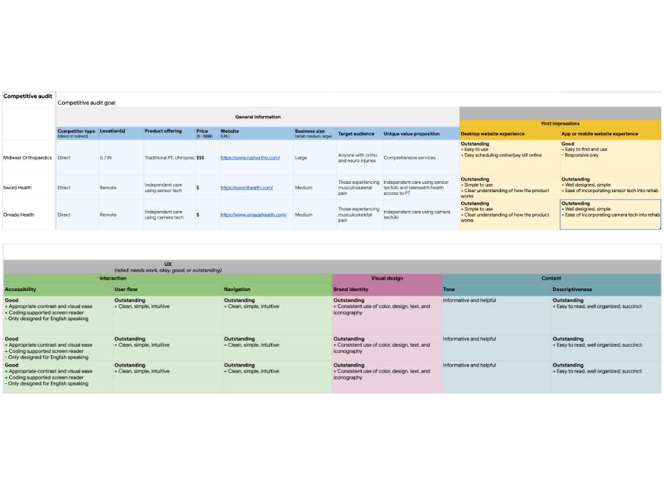
I audited several competitors to the MIM app before the ideation process. I identified the gaps and opportunities. The audit indicated that many physical therapy companies are great at scheduling and providing in-person care. I focused on the top physical therapy companies in the United States based on online searching. On the flip side, some virtual companies are using self-guided technology for independent care. I couldn’t find a company that combined in-person and self-guided physical therapy. 

The Design

From paper to reality.

The Design

Paper Wireframes

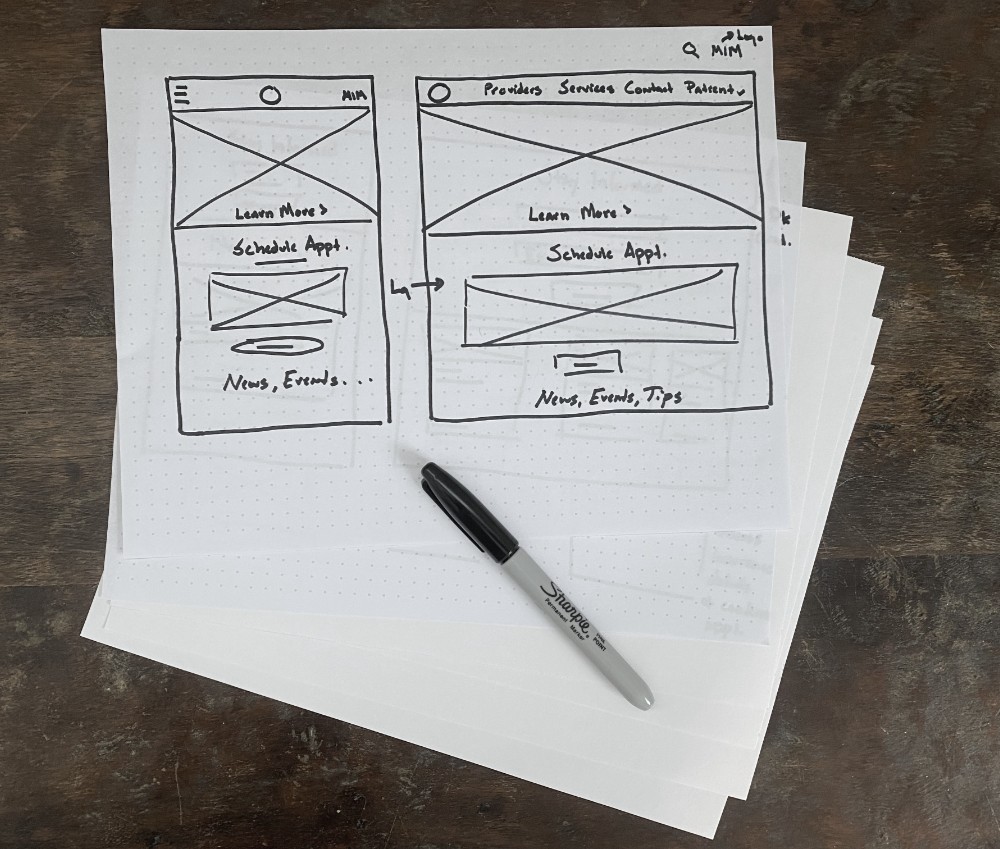
Taking the time to draft iterations of each screen of the MIM app and responsive Move Right PT website on paper. The priority was to make it easy for the patients to book an appropriate in-person treatment or self-guided treatment.

The Design

Digital Wireframes

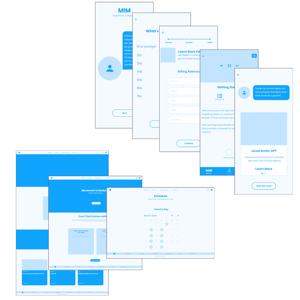
After creating the paper wireframes, it was time to get digital. I started with the MIM app. The app was the foundation of this project. Once the app was tested, I designed the Move Right PT responsive website. 

MIM app: Patient safety was above and beyond the visual designs and flow. The app needed to correctly direct a user to in-person care if their injury or pain was more complex or self-care if their pain was more minor. Having quick and more inexpensive access would remove the financial and safety barriers for the patients. In addition, I chose to create an AI assistant, Caia, to create a more friendly experience.

Responsive site: The responsive site needed to share visual characteristics that matched the app to create a good user experience. Hierarchical and card layouts were used with familiar navigation.

The Design

Digital Wireframes

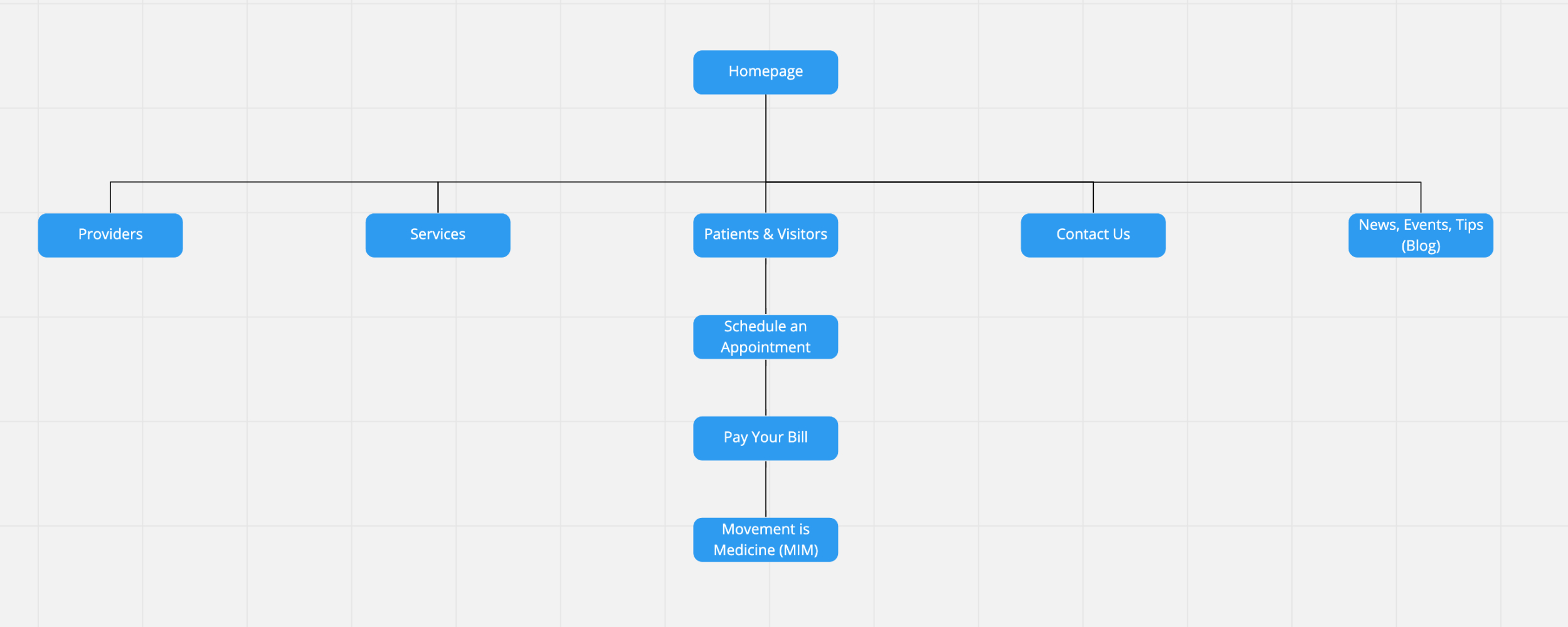
As part of designing the Move Right PT responsive website, I created a sitemap to streamline user flow. 

The Design

Low-Fidelity Prototypes

The digital wireframes of the MIM app and Move Right PT were converted to a low-fidelity prototype in preparation for user testing. In addition, the MIM app included two prototypes. One prototype demonstrated the flow to direct the user to a pre-designed self-guided physical therapy program. The other prototype connected the user with a physical therapist that matched their interests. 

The Design

Usability Study

Multiple unmoderated usability studies were done. The following were included in the usability studies:

  • MIM app
  • Move Right PT mobile websites (phone and tablet)
  • Move Right PT desktop website

Each item above had two studies to ensure that the user flow and objectives were met. All of the revisions included navigation to make the user flow smoother. 

Refining

After the usability studies, it’s time to create a masterpiece. Mockups were converted into high-fidelity prototypes.

Refining

Digital Wireframes

Mockups of the MIM app were created, and Caia came alive. Just as with the lo-fi wireframes, two versions of the mockups were needed. I needed to show the user flow of a patient being directed to a pre-designed physical therapy program and the designs for a user that was connected with a physical therapist.

Refining

Usability Study

The hi-fi usability studies focused on all aspects of the project, including the MIM app and the Move Right Physical Therapy responsive website. Two studies for app and site were done to add additional functionality and enhance the experience. Below are the findings from the lo-fi studies and hi-fi studies.

MIM APP FINDINGS

A link to describe how to connect the sensors was added. Users were unsure how the movement sensors worked.

Users desired to see a playlist of videos that made up the longer video for daily treatments.

Users desire to connect with a therapist if the pre-designed program doesn’t work. A mayday section was added.

MOVE RIGHT PT SITE

Users wanted a way to schedule an appointment from the website.

Users wanted a way to connect with the MIM app easily.

Refining

Accessibility

Hearing

Closed caption has been added to the videos to assist hearing-impaired individuals.

Vision

The design included high contrast to assist individuals with low contrast sensitivity. The designs also avoided color combinations that could be hard to distinguish.

Touch

Icons with text and a significant amount of padding were included to make it easy to use the icon's functionality. In addition, different finger sizes and those with impaired fine motor skills were considered during the design.

Conclusion

The MIM app combined with the responsive Move Right Physical Therapy site provides a hybrid approach to physical therapy. Minimally injured and minimal pain could be treated using pre-designed physical therapy programs combined with sensors that provide real-time feedback on form. Individuals with injuries and pain that are more involved would be easily connected with a physical therapist for in-person treatment. The hybrid physical therapy model would be an option to address the high costs of medical care and the reduced insurance reimbursement. 

It was a pleasure working on this project to create a solution to help many. 

Hybrid Physical Therapy

Combining in-person care with self-guided programs.

Artificial Intelligence

Using AI to guide critical medical decision and rehab plans.