Adaptive Training Plan

YEAR
November 2010 - September 2020
OUR ROLE
UX Research/Design, Prototype, Iteration
ATP: Adaptive Training Plan

ATP is a responsive membership site designed for triathletes for 90 Revolutions, Inc. The goal was to create online software that blended physical therapy-based activities with triathlon training plans. The unique aspect of the software is that is adapted based on the athletes biometric data. 

What to Solve

Project Overview

The Problem

Triathletes have a high reoccurrence rate of overuse injuries due to the demands of the sport. Most training plans online were static and didn’t adjust to athletes. 

The Goal

Design an app that blends physical therapy activities seamlessly with triathlon training plans. The challenging aspect was creating a solution to making plans adaptive based on biometric data. The goal was to create a app to remove the confusion of training, while minimizing the rate of injuries.

Roles and Responsibilities

Execution

My Role

UX designer and project manager designing an app for 90 Revolutions, Inc. from conception to delivery.

Responsibilities

Conducting interviews, using conditional logic/coding to periodize adaptive training plans, paper/digital wireframing, low/high-fidelity prototyping, conducting usability studies, accounting for accessibility, and iterating on designs.

The User

I conducted in-person interviews with 23 physical therapy patients.

PERSONA 1

Donna (43 yo)
Donna is a 43-year-old that is new to triathlons. She desires to do a half Ironman triathlon in six months. Donna is an attorney and single. She works about 50 hours each week. Completing a full Ironman is on her bucketlist. The problem is that Donna has had several knee injuries when running. "I'm all about pushing myself, but this knee pain makes it difficult to run the extra miles."

PERSONA 2

Caleb (50 yo)
Caleb is a 50-year-old that has been doing triathlons for the past five years. He has been bit by the endurance bug. Next year, he wants to complete a full Ironman. Caleb is getting faster and stronger but wants the extra edge. He's part of a local triathlon club. In the club, Caleb follows the static triathlon training plan. He wants to get faster and feels that the static plan isn't giving him the extra edge. "I'm no longer a rookie. I want to place higher in my age group."

PERSONA 3

Ryan (28 yo)
Ryan is a 28-year-old doing triathlons for the past two years. He wants to complete a half-distance Ironman next year. Ryan has gone through some significant life changes. He and his wife recently had a baby, and he has been moving up in his career as a software engineer as a government contractor in cyber security. Ryan has been very busy, with less sleep from the newborn and working 50+ hours a week. He wants to reach his endurance goal but is unsure how to balance everything. "Life is getting crazy. I wish I had more hours in the day."
User Research

Pain Points

Time

Many recreational triathletes were unsure how to incorporate training into their daily lives. It's challenging to train for several hours during the week and maintain a balanced life.

Financial

During the interview process, all of the athletes had a history of overuse injuries. However, none of them knew how to prevent the injuries from reoccurring. The athletes wanted not to get hurt but were more focused on getting faster.

Safety

During the interview process, it was discovered that most recreational athletes didn't know how to safely structure a training plan that blends rest, recovery, and intensity. Most of the athletes used static plans online or from a club. The athletes didn't know where to start to create a plan that matched their history and lifestyle. ​

User Research

Competitive Audit

I audited several competitors to the ATP site before the ideation process. I identified the gaps and opportunities. The audit indicated that several companies organized and displayed training plans for triathletes and other endurance athletes. The ATP membership site was a maturing piece of software originating in 2010. In 2010, all of the competitors didn’t have plans that adapted to the individual need of the athletes. Furthermore, none of the competitors included physical therapy-based activities designed to reduce overuse injuries when training. These gaps were unique opportunities for 90 Revolutions, Inc. to fill.

The Design

From paper to reality.

The Design

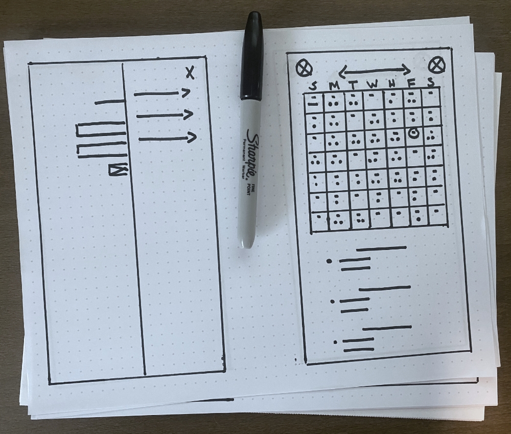
Paper Wireframes

The ATP site design started as a mobile responsive site based on the requests from previous interviews. A desktop version was also created for the user and admin. The admin part of the site was only designed for a desktop based upon request and to reduce costs. The priority was to make it easy for athletes to view the training session and immediately start training

The Design

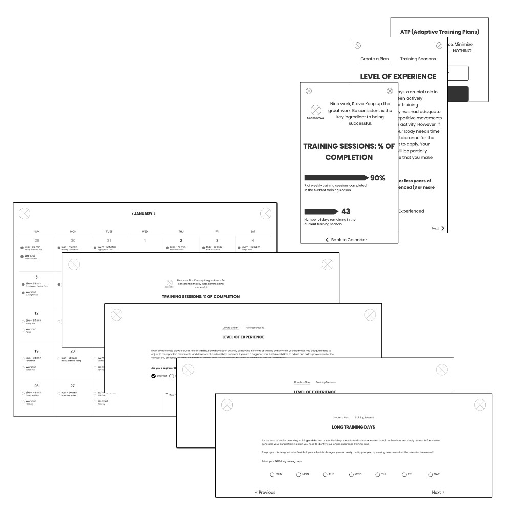
Digital Wireframes

Moving from paper to digital included several iterations from 2010 to 2020. From the very beginning, the frontend of the design was intended to be minimal and simple. However, the site’s backend was complicated, using proprietary coding to adapt a training plan to the user. During the earliest phases of development, workout files (.FIT) were uploaded from Garmin training devices (i.e., watch, bike computer). Several calculations occurred to adjust the plan. Internal uploading and calculations were reduced as time progressed since the training devices eventually included their software to streamline the training process. As biometric technology, so did the ATP membership site.

The Design

Digital Wireframes

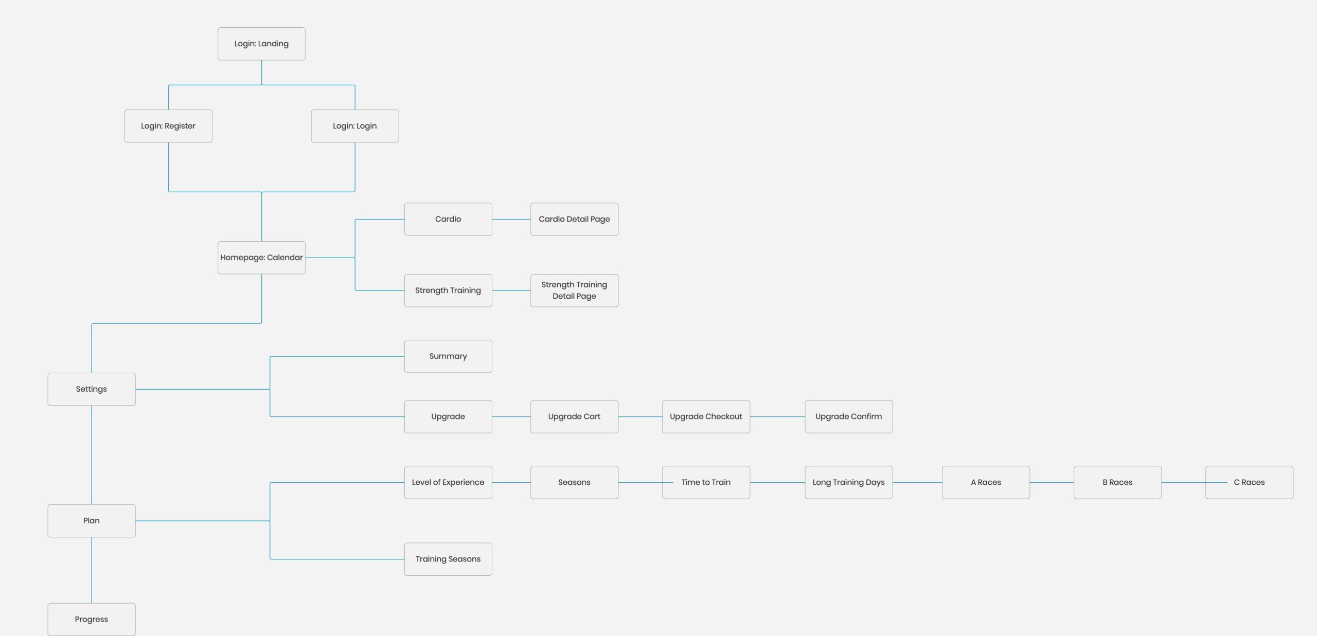
A sitemap was created to ensure that the user’s experience was simple and intuitive.

The Design

Low-Fidelity Prototypes

The digital wireframes of the ATP membership site were converted to a low-fidelity prototype in preparation for user testing. Axure was the tool of choice to turn this project into reality.

ATP: MOBILE
ATP: ADMIN
ATP: DESKTOP
The Design

Usability Study

Multiple unmoderated and moderated in-person usability studies were done throughout the product’s life. Initially, some pages permitted the upload of workout files (.FIT) and calculated biometric data. These pages were eliminated since athletes’ training devices included software to monitor the athlete’s recovery.

Refining

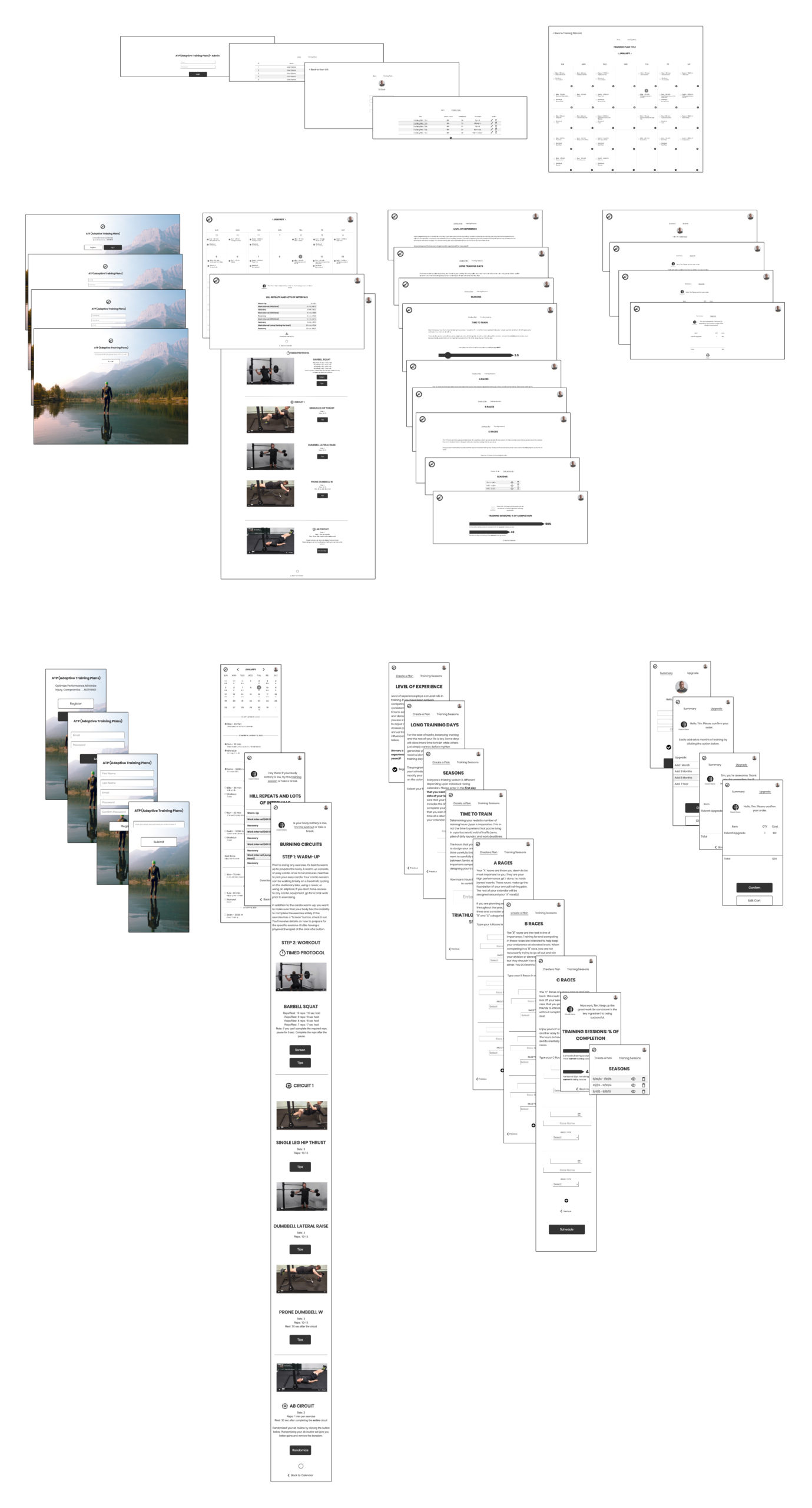
After the usability studies, it’s time to create a masterpiece. Mockups were converted into high-fidelity prototypes.

Refining

Digital Wireframes

Mockups of the ATP membership website were created based on the findings from the usability studies of the lo-fi prototype. The mockups below are the result of several iterations from 2010 to 2020.

Refining

Usability Study

The final hi-fi usability studies focused on minimizing pages and functionality since the updated ATP site no longer required the ability to upload data files and do complex calculations. The focus was simplicity in design and usage.

PRIOR DESIGN CONSIDERATIONS

A priority at the beginning of design included the ability to upload and interpret .FIT files.

Once the data was extrapolated from the .FIT files, calculations were required to determine if the user was recovered and how to advance the training plan.

Based on triathlon research, a system had to be created to periodize/filter the training plan based on the user's performance and recovery.

FINAL DESIGN

Once Garmin training devices (i.e., watches, bike computers) included internal functionality to measure recovery, the ability to upload .FIT files and the calculations were removed from ATP. This functionality was replaced by providing alternative training activities based on the Garmin device's recommendation. Simplifying the membership site minimized the cost of maintenance and made the software easier to use.

Refining

High-Fidelity Prototypes

The final prototypes included the new features identified in usability studies. The prototype were made engineer ready.

Refining

Accessibility

Hearing

Closed caption has been added to the videos to assist hearing-impaired individuals.

Vision

The design included high contrast to assist individuals with low contrast sensitivity. The designs also avoided color combinations that could be hard to distinguish.

Touch

Icons with text and a significant amount of padding were included to make it easy to use the icon's functionality. In addition, different finger sizes and those with impaired fine motor skills were considered during the design.

Conclusion

It has been a pleasure to be part of designing the ATP membership site from conceptualization to the final product. Hundreds of athletes were helped, and the rate of injury was minimized. The site started as a basic idea based on a pieced together membership WordPress site with embedded Youtube videos. Initially, the software was an advanced Laravel site but became more simplified based on evolving biometric technology. The software was discontinued in 2020 because it was more advantageous to use third-party software combined with training devices that include recovery guidance.

Adaptive Triathlon Training Plans

Combining biometric technology with physical therapy treatment.

A Lesson on Simplicity

As technology improves, so does simplicity for the user.