Physical Therapy App
Rev Fitness is an online physical therapy-based company created to complement the in-person clinical experience after a patient is discharged. The physical therapy clinic focuses mainly on treating advanced athletes that specialize in cycling and running. The Rev Fitness App provides physical therapy-based strengthening plans that blend with cycling.
Project Overview
The Problem
After a patient is discharged, they need an ever-changing exercise program to prevent future injuries and challenge their body. Designing a physical therapy-based program requires years of training and clinical experience. Patients are often confused and frustrated when exercising after recovering from an injury.
The Goal
Design an app that provides physical therapy-based exercise programs that first targets cyclists. Cyclists are one of the main clientele.
Execution
My Role
UX designer designing an app for Rev Fitness from conception to delivery.
Responsibilities
Conducting interviews, paper and digital wireframing, low and high-fidelity prototyping, conducting usability studies, accounting for accessibility, and iterating on designs.
The User
I conducted interviews with five physical therapy patients.
Pain Points
Time
Working adults don’t have the time to create exercise programs and attend long-term PT. In addition, some weren’t confident in time management to do exercises and activities beyond PT.
Financial
Most of the users were concerned about the cost of physical therapy care but wanted to remain healthy.
Lack of Knowledge
Many users didn’t know what to do after physical therapy to complete their goals.
The Design
From paper to reality.
Paper Wireframes
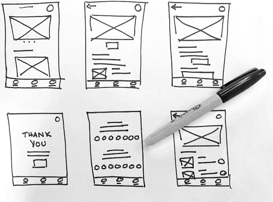
Taking the time to draft iterations of each screen of the app on paper made it easy to draft the wireframes before going digital quickly. The priority was to make it easy to select a training plan that suited the user’s life.
Low-Fidelity Prototypes
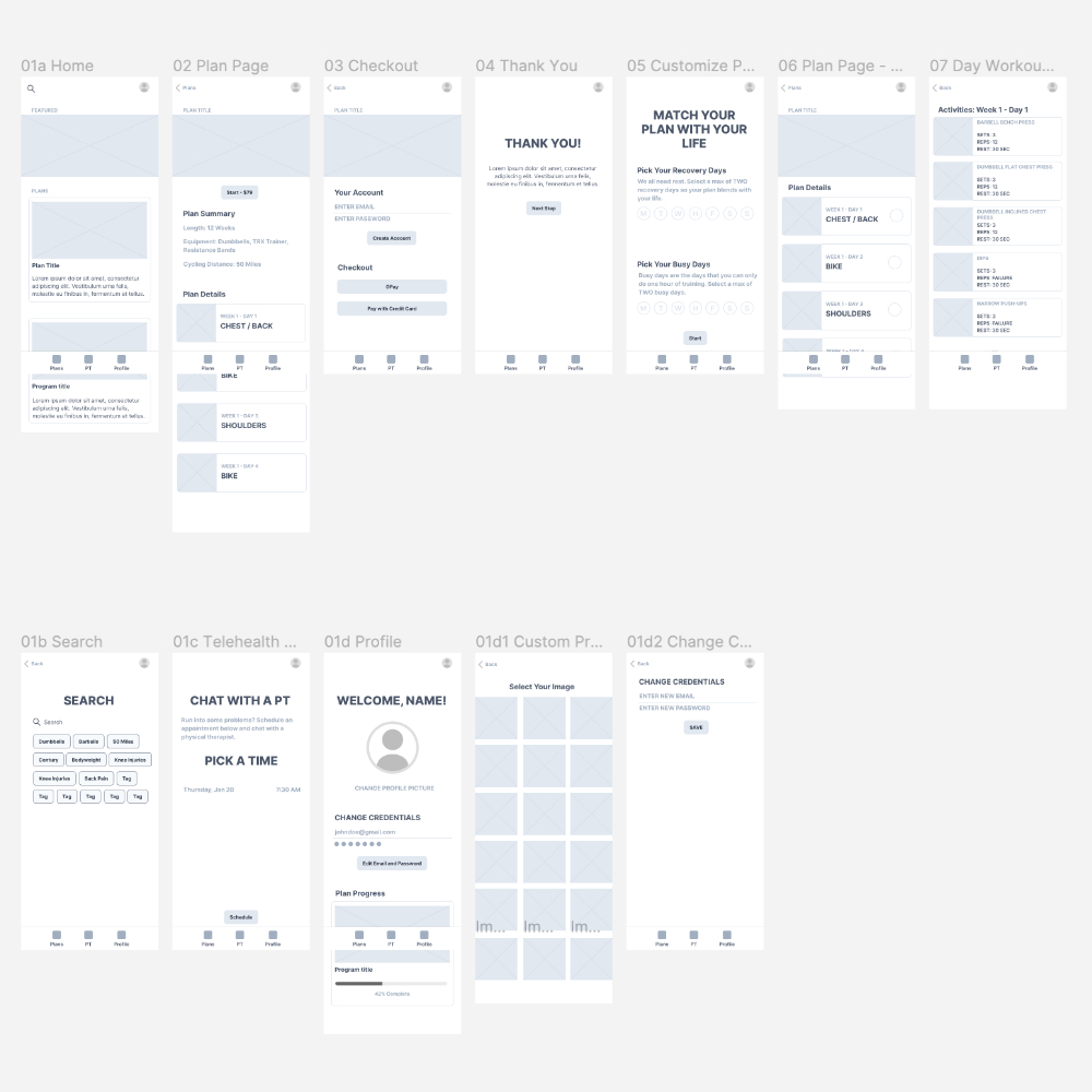
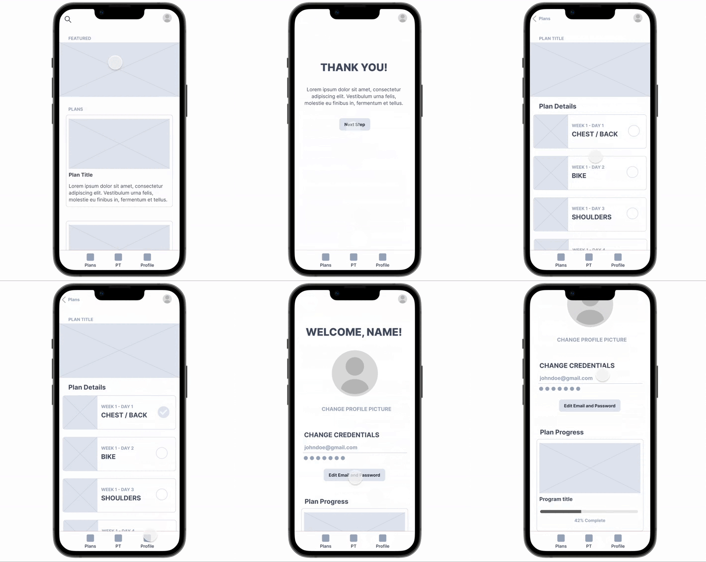
Using the completed set of digital wireframes, I created a low-fidelity prototype. The primary goal of the user flow was to make it easy for the user to select a training plan that fits their schedule.
Usability Study
Two unmoderated usability studies were conducted with former physical therapy patients to fine-tune the design. The first round of usability studies indicated areas that needed to be addressed to create a smooth user experience. The second round of studies indicated two new features that would improve the experience of using the Rev Fitness App.
Users had difficulty editing their profiles.
Users didn’t understand the Customized Your Training Plan.
Users desired the use of a calendar to schedule a physical therapist consultation.
Users wanted a “swap” function in case an exercise created pain.
Users wanted a way to preview individual exercises.
Competitive Analysis
I reviewed several direct and indirect competitors to Rev Fitness. The gaps were identified, and the following opportunities were more apparent:
- Integrate into the app the ability to track progress when cycling.
- Integrate into the app the ability to organize the training plans onto a calendar and blend with a personal calendar to aid with time management.
- Ability to adjust the schedule so the sessions blend with the unique needs of the users.
Refining
After the usability studies, it’s time to create a masterpiece. Mockups were converted into high-fidelity prototypes.
Hi-Fi Prototypes > "Swap Feature"
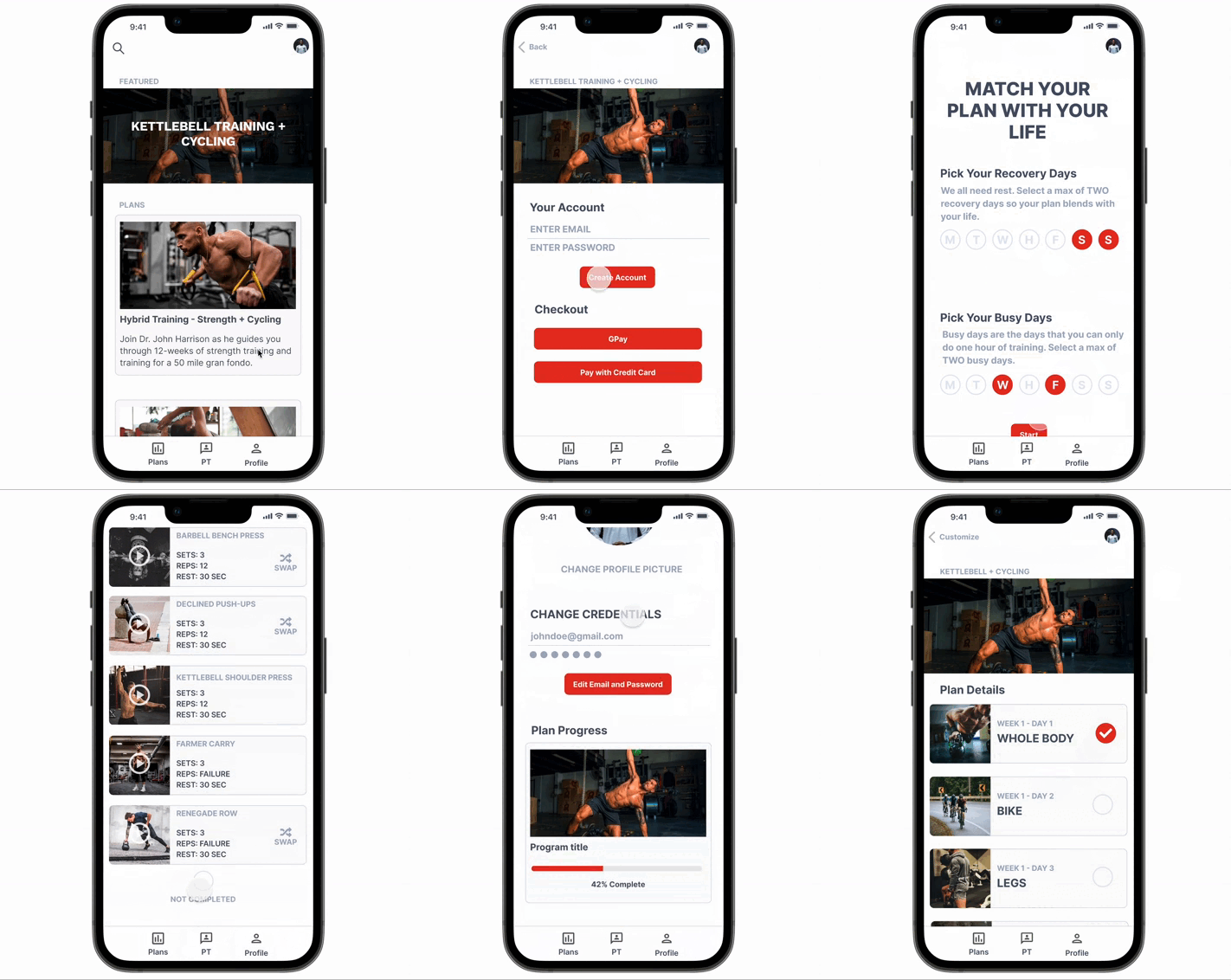
After more research, I learned that past physical therapy clients desired the ability to “swap” out an exercise. The “swap” feature permitted the ability to replace the exercise with one that focuses on the same muscles but provides an alternative if the original exercise causes pain.

Hi-Fi Prototypes > "Preview Feature"
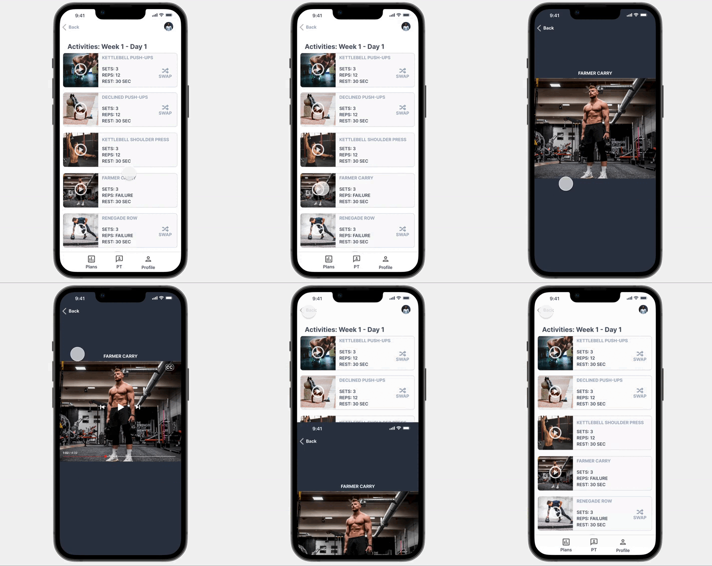
More research indicated that users wanted a quick view of an individual exercise. A preview button was added to each exercise video, which triggered a modal video popup for instructions and quick viewing.
The Finale
The final high-fidelity prototype was created after adding the new features.
Accessibility
Hearing
Closed caption has been added to the videos to assist hearing-impaired individuals.
Vision
The design included high contrast to assist individuals with low contrast sensitivity. The designs also avoided color combinations that could be hard to distinguish.
Touch
Icons with text and a significant amount of padding were included to make it easy to use the icon's functionality. In addition, different finger sizes and those with impaired fine motor skills were considered during the design.
Conclusion
The Rev Fitness App keeps former patients connected and feeling like they’re getting personalized treatment outside the clinical walls. It has been a pleasure being part of the design and impacting many people. Future designs and research could include training for runners and live feedback when exercising on your form.
Physical therapy for runners
Running programs that blend with physical therapy-based strengthening.
Realtime feedback
Using video analysis or sensor technology to ensure you're training right.


